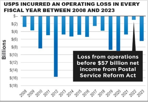
Chart shows post office spiraling failures (at your expense). Consider this article the next time you don’t get your mail till WAY after dark, or you’re 10th in line waitin’ for the one clerk on duty while holding the 10 lb package you came there to mail. The chart below is misleading. Instead of blue, the column color should be red – the universal standard to show a loss.

I am boycotting the United States Postal Service. I will not be sending out any unnecessary mail. I had a terrible experience with a Priority Mail Box that literally got ate by a machine, items damaged, finally sent in another box with items missing and broken. There is no way to get a refund on the service nor the damage caused to existing items that were received. If you have to use a Priority Mail Box, take pictures, do not send anything you don’t have a receipt on, and check right away when it goes missing. This is the worst company to rely on and yet they make oodles of money from us.